Rebranding this Legend is monumental
How do you redesign a nearly century old brand and still maintain its heritage and the ritual for Twist, Lick and Dunk!. We started by aligning the letterforms, and giving them a 3-D effect to mimic the cookies creme filling. Arching them heroically over the darker Oreo blue nameplate for contrast and finishing with a cyan piped surround to help the make a seamless transition over a growing family of products.
Being Iconic with the worlds most Iconic cookie.
How better to show off "Milks Favorite Cookie" than with a supersized Oreo dunking into milk!
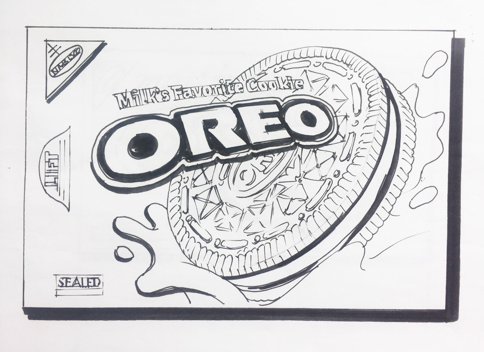
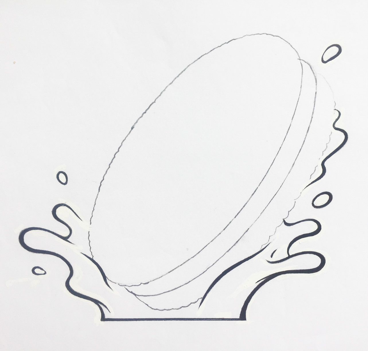
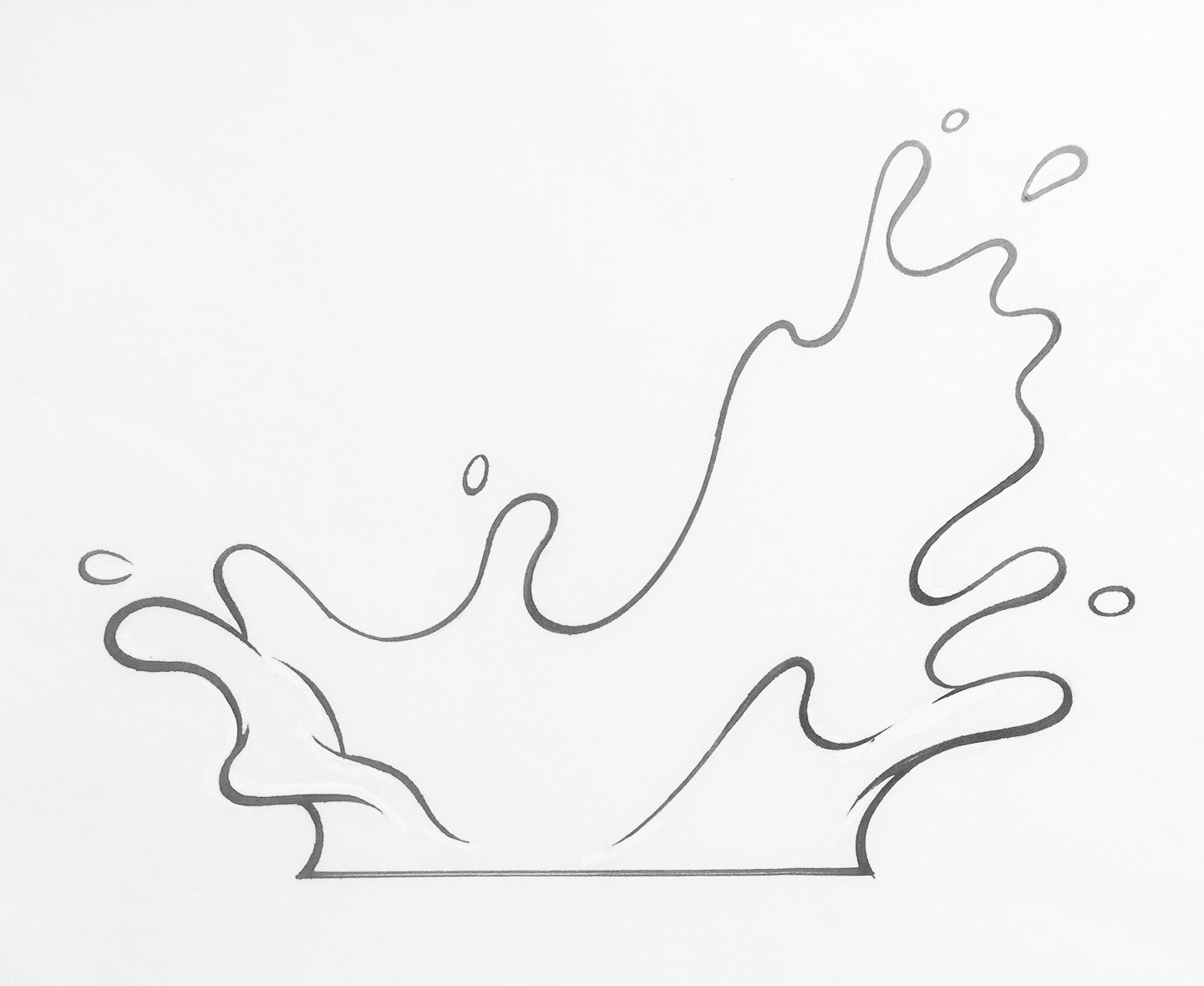
Concept sketches with cookie placement and optional milk dunks
Seasonal varieties
Winter Oreo
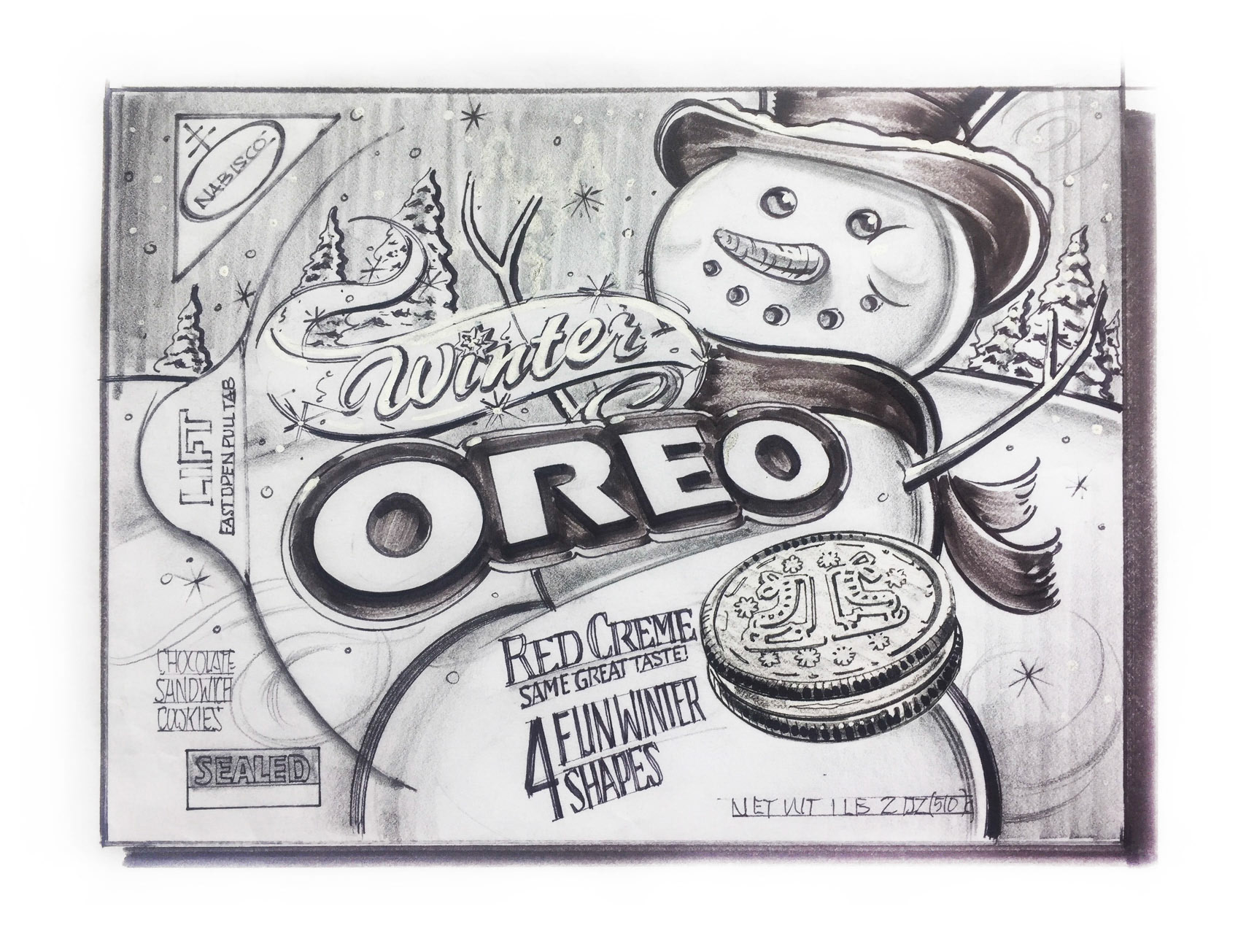
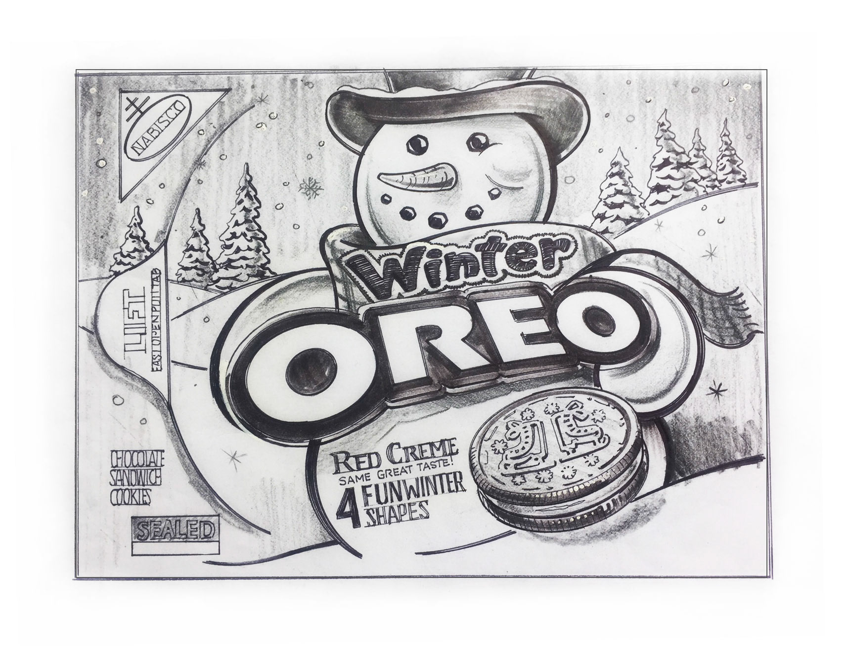
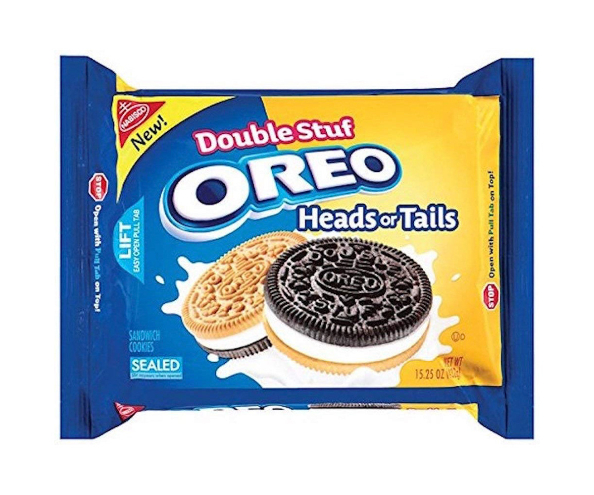
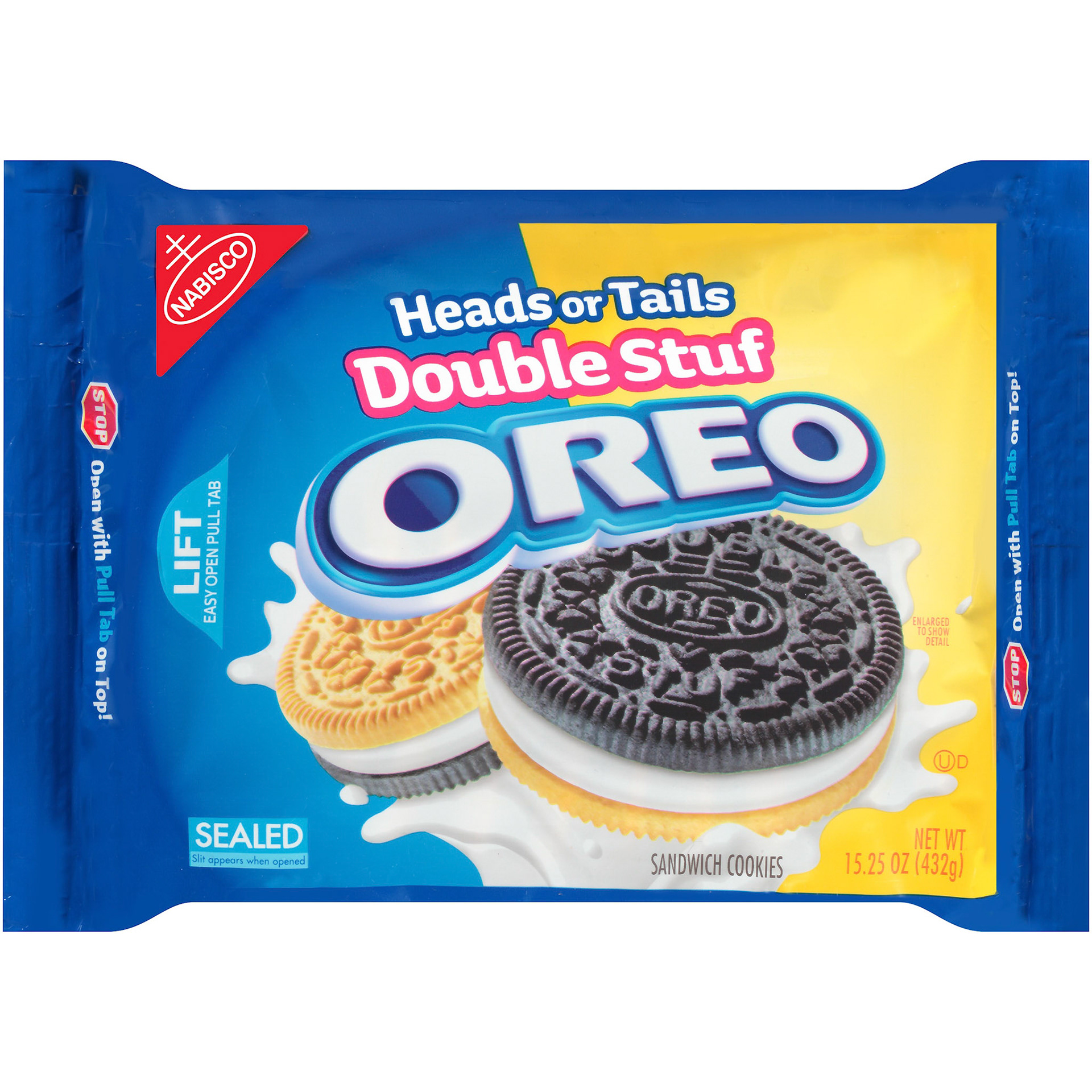
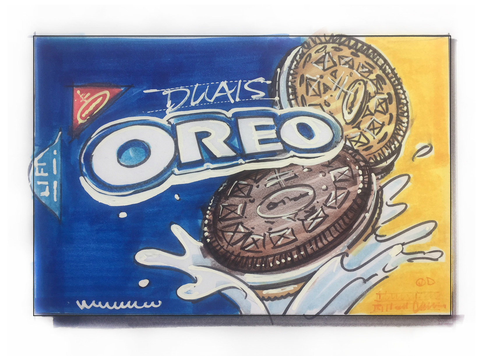
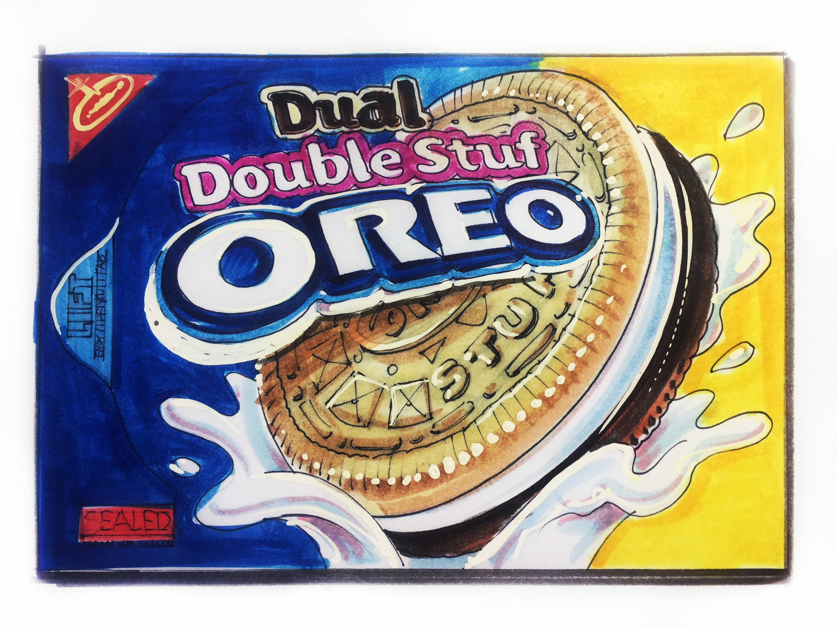
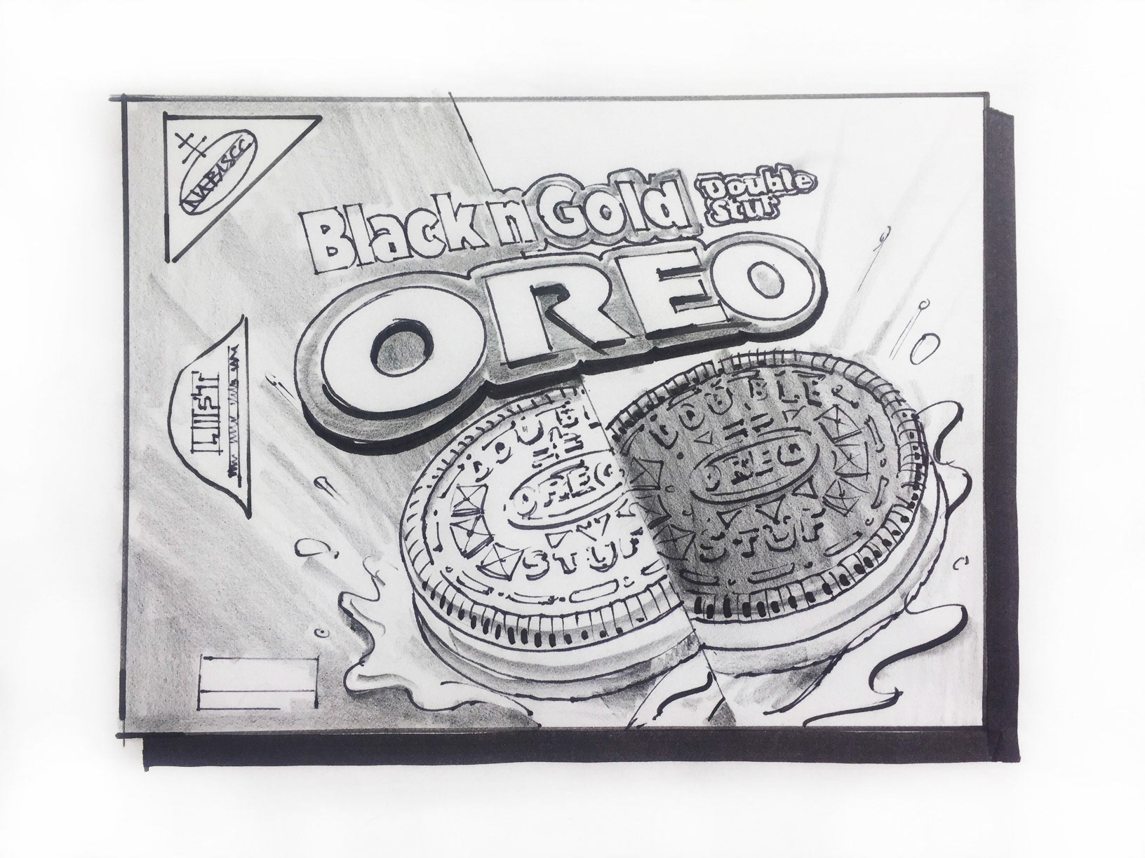
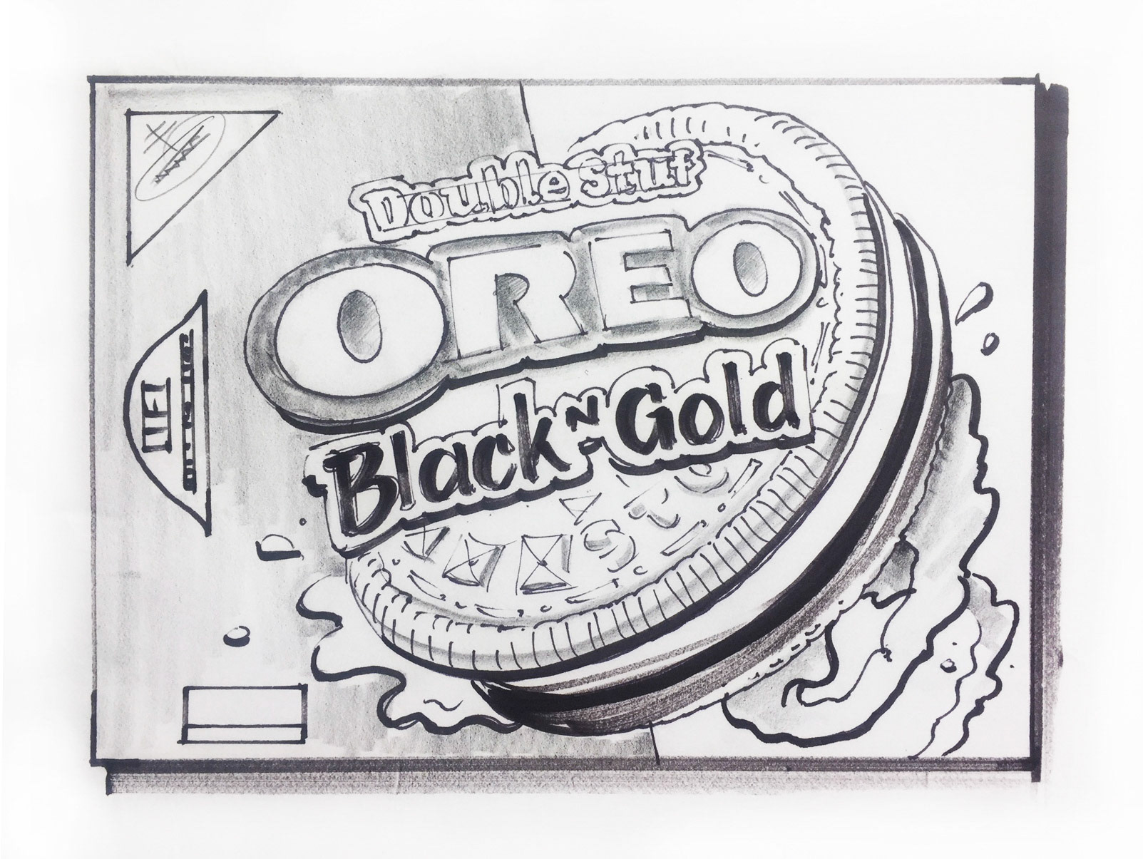
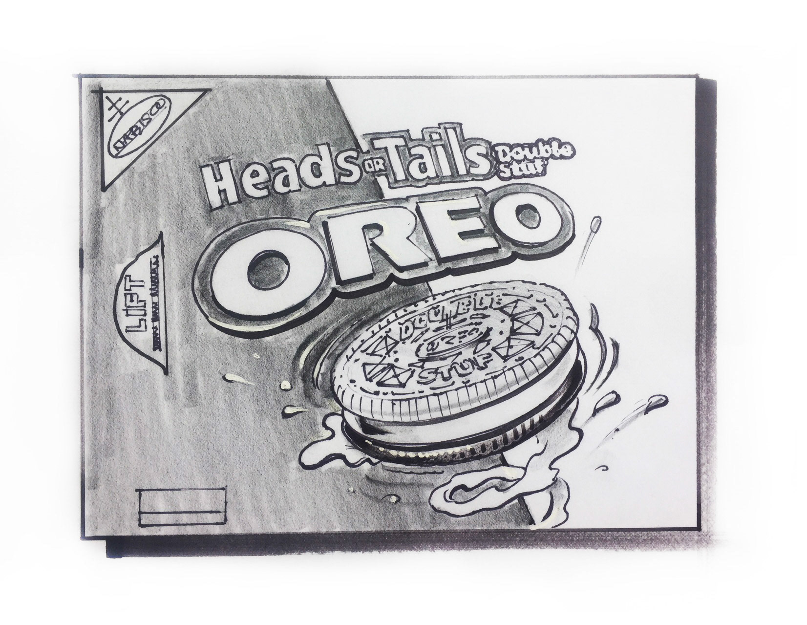
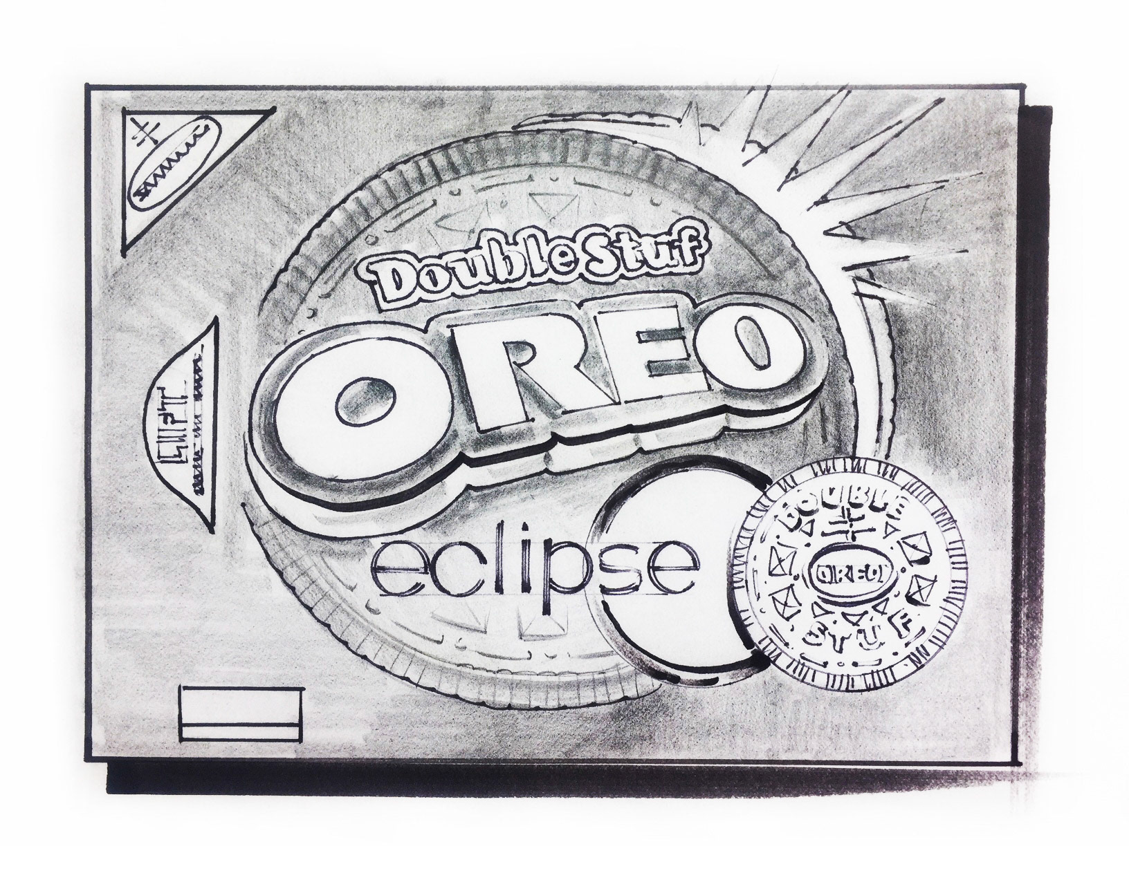
Additional sketches with naming options.
Fudge Enrobed Oreo
This was just one of our limited edition family, with hundreds of flavors and a multitude of shapes and sizes, there is no limit to the potential combination and co-branding potential of this franchise.
original sketch
Retro Oreo and Ritz
The whole supersized Oreo Visual was originally used in the club store arena with such success that it paved the way for the current " Big Cookie" visual that is currently Oreo.
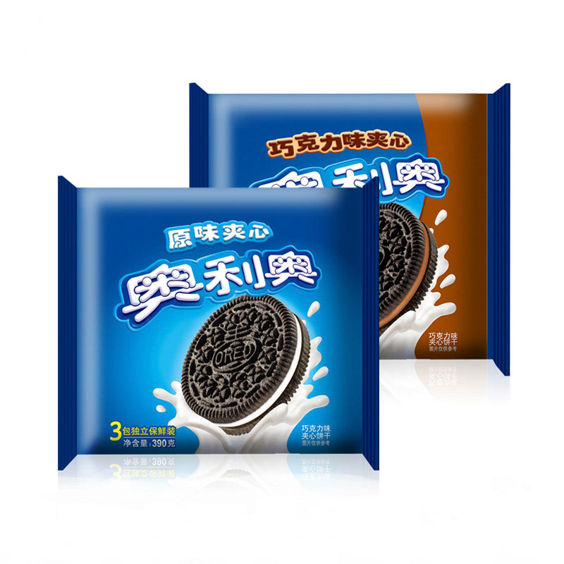
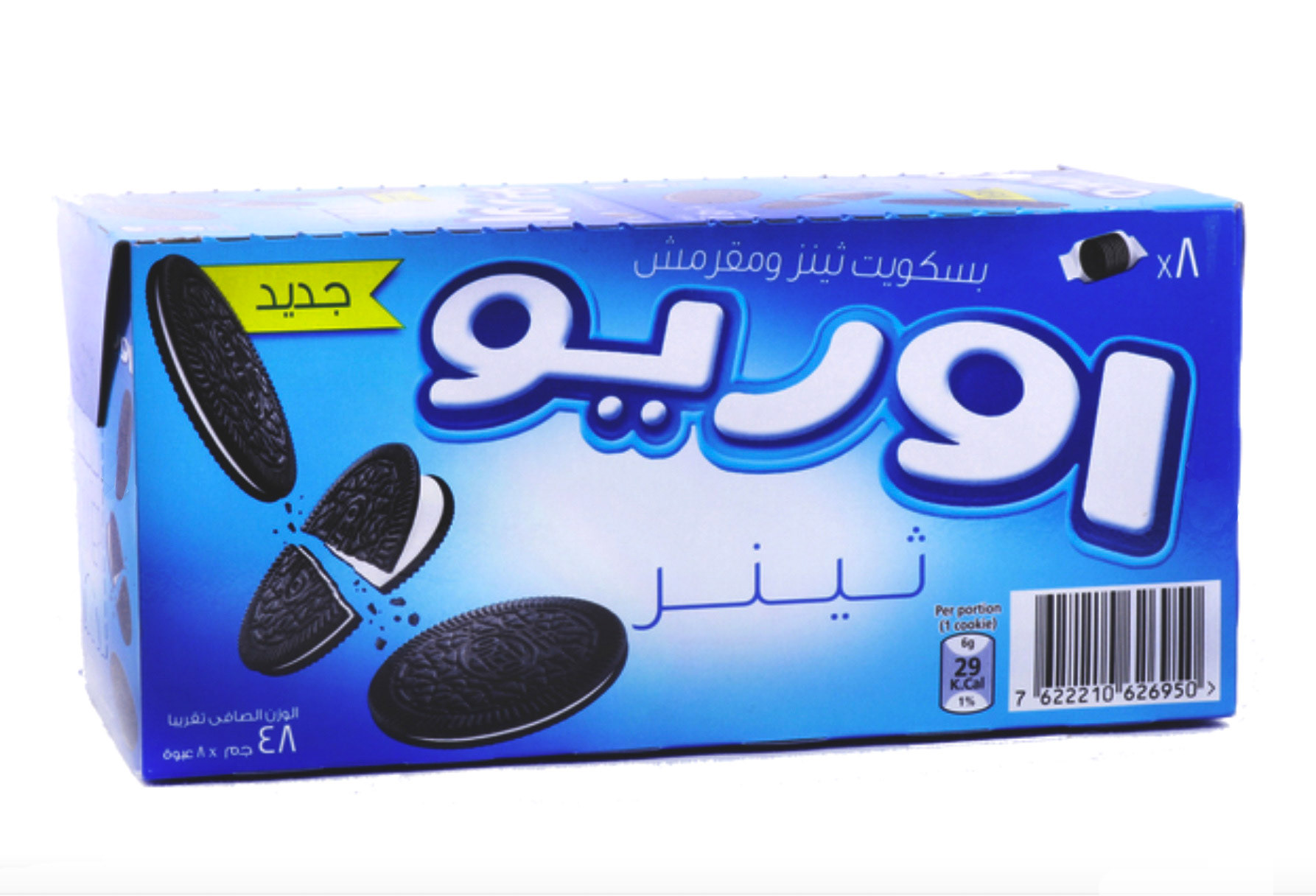
The Oreo brand is loved the world over from China to Europe, the Middle East and South America, nothing says sandwich cookie like OREO.