When Marie Callender's wanted to refresh and update their brand mark and packaging, we knew just what to do. Overall it was simple to see that there were too many separate elements at work on the face panels. Our idea was to Combine all the common elements into one local area and focus our attention on the main entree. We took the time to clean up and enlarge The font for better recognition through the freezer doors, and incorporate the new cameo of Marie and her granddaughter on the signature green place mat, sharing a nostalgic moment.
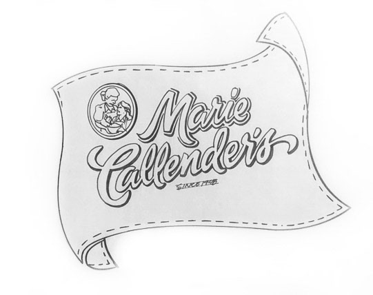
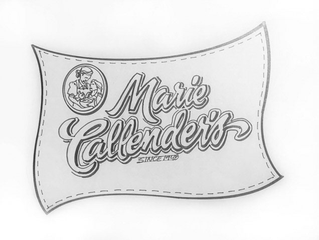
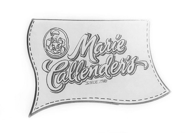
Logo sketches for packaging as well as stand alone and other corporate applications.
The heavy green checkerboard background was refreshed with a kitchen countertop and a warmly lit window. With the introduction of some fresh greens in the brand mark and background and a focus on the entree, we think the packaging takes on the same attention to detail and pride that Marie herself crafts into every meal.
Fresh new look!
Hundreds of photos and recipes were masterfully created and shot at Bruton Strobe studios in St.Louis, MO. I provided art direction and creative in accordance with Conagra Brands, Inc.
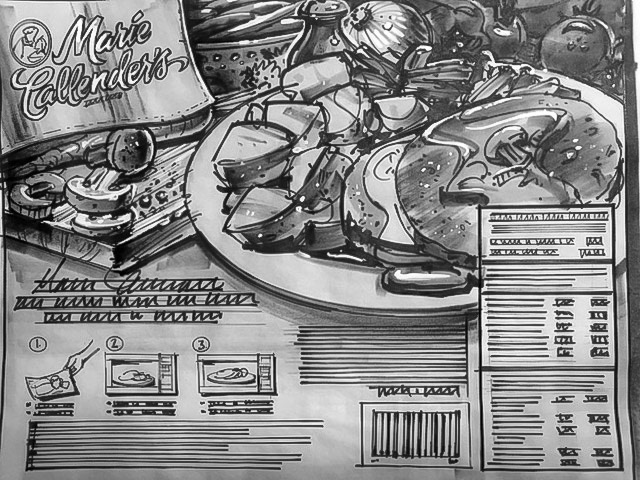
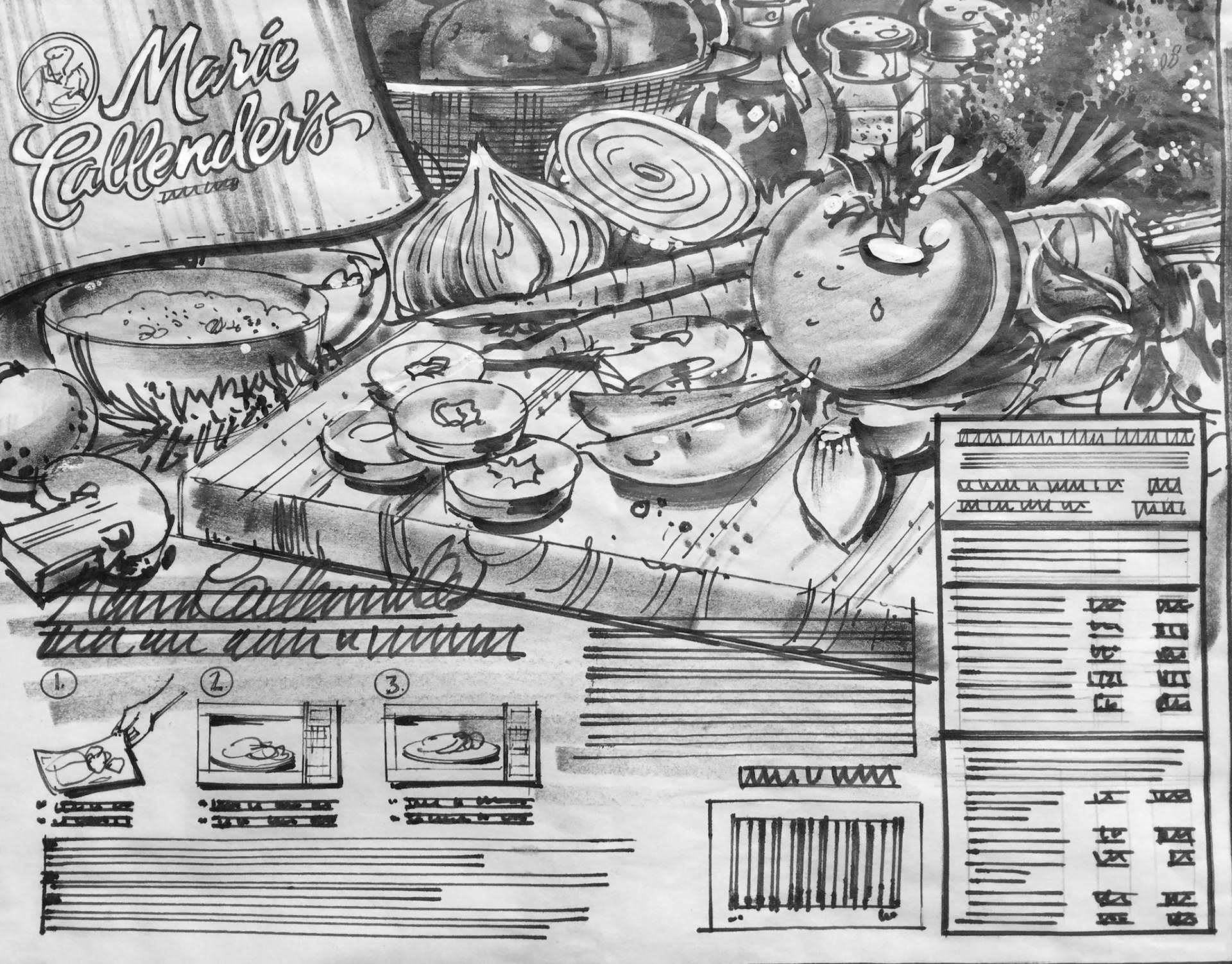
Example of back panel romance copy and sketches for photo layout.